|
Describing Data with Pictures |
Index to Module One Notes |
|
Describing Data with Pictures |
Index to Module One Notes |
This section of Module 1 will get us into
Microsoft Excel, and take us to the point of creating a histogram
summary of numerical data. Table 1.2.1 shows two and a half years of
cycle time data from the manufacturing firm introduced in Module 1.1
Notes.
Table 1.2.1
|
|
|
|
|
|
|
|
|
|
|
|
|
|
|
|
|
|
|
|
|
|
|
|
|
|
|
|
|
|
|
|
|
|
|
|
|
|
|
|
|
|
|
|
|
|
|
|
|
|
|
|
|
|
|
|
|
|
|
|
|
|
|
|
Enter this data into a single column in a
Microsoft Excel spreadsheet. For some extra practice with Excel
features, you can place this column to the right of a column for
Month/Yr, as shown in Worksheet 1.2.1. For example, I placed the
months of the years in column A. Thus, column A, row 1 (cell A1), has
the title and the specific months go from cell A2 to A31. In
Microsoft Excel 98 and 2000, the default format for month/year is
Mon-XX. So, when I typed January 1997 in Cell A2, and hit the
enter key, Jan-97 appeared (you can change the default format
of any cell by selecting Format on the Standard Toolbar, then
Cells from the pulldown menu, then the Number tab, then
whatever format is desired from the available list). Now, if you
select cell A2, note a small square in the lower right of the
highlighted cell border. Click and drag that square down to cell A31
and all of the months/years will enter successively - slick,
huh?!
Cell B1 has the title for the variable "Time," and the data is
entered from cell B2 to B31. There is no magic way of entering the
data for the variable "Time" in column B, at least not until I get
voice data entry capability. Of course, the typical FGCU MBA student
has data entry employees who can do this for them at work -
right?!!
An aside: if you have any questions about Excel as we go through the
course, please e-mail/call me so we can get them resolved quickly.
Another option for questions: I find the Excel Help feature getting
better and better with each version, but it is getting so big that
you seem to need basic search engine skills to locate your topic
quickly.
I then copied the Time column into Column C and re-titled it
"Sorted." One way to copy a range of data: select or highlight cells
B1 to B31 by clicking on B1, then dragging to B31, select the
Copy Icon on the Formatting Toolbar, select or highlight Cell
C1, and click the Paste Icon on the Formatting Toolbar. Sort
the data from lowest to highest by selecting or highlighting Cells C1
to C31, then click on the Sort Ascending Icon (A to Z) on the
Formatting Toolbar. Note that his technique sorts the data in rows
based on the content of one column. To sort the data in rows based on
contents of two or more columns, select the rows and columns of your
data range, click on Data on the Standard Toolbar, select
Sort from the pulldown menu, and then follow the dialog screen
entry instructions.
Did you replicate the columns in Worksheet 1.2.1? If not, you should
e-mail or phone me for help. If so, save your work to a file before
going on. Assignment 1 requires entry of your data, copying to a
separate column, then sorting the duplicate column of data (Items 1
and 2 of Project Assignment 1).
Worksheet 1.2.1
Month/Yr Time Sorted Jan-97 19 16 Feb-97 21 17 Mar-97 20 18 Apr-97 16 18 May-97 18 18 Jun-97 23 19 Jul-97 22 19 Aug-97 24 19 Sep-97 17 19 Oct-97 26 20 Nov-97 20 20 Dec-97 21 20 Jan-98 20 20 Feb-98 22 20 Mar-98 19 21 Apr-98 20 21 May-98 23 21 Jun-98 19 21 Jul-98 27 21 Aug-98 22 21 Sep-98 18 22 Oct-98 20 22 Nov-98 19 22 Dec-98 18 23 Jan-99 21 23 Feb-99 21 24 Mar-99 29 25 Apr-99 25 26 May-99 21 27 Jun-99 21 29
Now it's time to create a histogram to
summarize the data in a picture. As we will see, the histogram tells
us something about the center of the data, the spread of the data,
and the shape of the data. Bin Frequency 16 1 18.6 4 21.2 15 23.8 5 26.4 3 More 2
The fastest way to create a histogram is to use the Data Analysis
Histogram Tool. To do this, you have to activate the Data Analysis
Add-In feature of Excel. Select Tools on the Standard Menu Bar
and check to see if Data Analysis is available on the pulldown
menu. If not, select Add-Ins and the Add-Ins dialogue box will
appear. Select the Analysis ToolPak check box. Click OK
and exit Excel (CAUTION: Save your Excel File before exiting).
When you open Excel, the Data Analysis Add-In feature should be
available through the Tools pulldown menu on the Standard Toolbar.
If the Analysis ToolPak selection is not available in the
Add-Ins, the Data Analysis component was probably not included when
your copy of Excel was installed on your computer. Select Help
on the Standard Toolbar, then select Microsoft Excel Help in
the pulldown menu, select the Index tab, type keyword
"Installation," select Search, and then select Install or
Remove Individual Features, and follow the instructions. The Data
Analysis component allows Excel to be somewhat competitive with
statistical software packages. The component doesn't have the full
functionality of software packages such as Minitab, SPSS or SAS, but
it has the features commonly used in business applications... and
these are on a spreadsheet used by most of the world.
After you have activated this important "Add In" that we will be
using throughout this course, create a histogram. To do this, select
Tools on the Standard Toolbar, then Data Analysis from
the pulldown menu and respond to the dialog screen. I entered C1:C31
for the input range and checked Label in the Label Checkbox.
This means that the first cell of my data range actually is a title
rather than a data entry. If I would have entered C2:C31 for the
input range, I would not have checked Label (if you are like
me, you will make this mistake several times before you get the hang
of Excel Data Analysis dialog screens). Skip bin range to let the
software create a default set of frequency bars for the histogram. I
like to put the histogram on the same page as my data so I select
Output Range, then put the cursor in the rectangle next to
Output Range, and type in a cell location for placement of my
histogram. The cell location will identify the upper left corner of
where the histogram will appear in the worksheet, so just make sure
the worksheet is clear to the right and down from the selected cell
location. I entered D1 as the worksheet was empty to the right and
down from D1. Select Chart Output and OK and you should
get something like Worksheet 1.2.2.
Worksheet 1.2.2
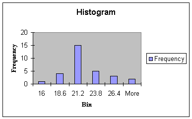
The bins of the histogram represent a
convenient way of summarizing the data by showing the
frequency of observations at preselected intervals - the
family name given to this type of chart then, is the frequency
distribution. The histogram shows one observation in the Bin
labeled 16. Next, there are 4 observations in the Bin with a value of
18.6 (observations with values of 17, 18, 18, and 18). This means
that in the interval of numbers greater than 16 and less than 18.6
there are four numbers: 17, 18, 18, and 18. Likewise, there are 15
numbers in the interval of numbers greater than 18.6 and less than
21.2, and so forth. The bin labels are the upper limits of each class
interval chosen by Excel.
How did Excel determine the interval of each bin should be 2.6? It's
fairly simple, actually (you can skim this and the next paragraph if
you want to go directly to interpretation of Center and Spread
below). First, Excel computes the range of the data: highest number
minus the lowest number = 29 - 16 = 13. Next, Excel divides the range
by the number of intervals or bars desired to summarize and display
the data. The default number of intervals is 5, so 13 divided by 5
gives a class interval range of 2.6. Now Excel divides the numbers 16
through 29 into five class intervals, each with a range of 2.6.
- The first interval includes the numbers < 16 (there is one 16)
- The second interval includes numbers > 16 to 18.6
- The third interval includes the numbers > 18.6 to 21.2
- The fourth interval includes the numbers > 21.2 to 23.8
- The fifth interval includes the numbers > 23.8 to 26.4
- The last interval is titled "More" by Excel: and includes all the numbers above the last upper limit (26.4 in this case) for placing in an extra "bucket" or bin.
Some notes on the location and shape of the chart: What if you do not like the location of the histogram? Select the histogram by pointing and clicking anywhere on the white area of the chart. You should see 8 small squares called "handles" around the border of the chart. Now, click again anywhere on the white area of the histogram and drag the chart wherever you wish. You can also change the shape of the histogram. Point and click on the middle handle on the left border and drag to the left to make the historgram longer to the left, or drag into the histogram to make it smaller - you can do the same to the right side. Point and click on the middle handle of the top border and drag up to make the histogram wider to the top - same for the bottom. If you point, click and drag a handle on the corner, the histogram gets larger if you drag out, or smaller if you drag in. If you point and click on the histogram, select File on the Standard Toolbar, and Print, you can print just the histogram. If you do not point and click on the histogram and select File and Print, you can print the histogram and whatever else is on the worksheet, such as the data. I like to select File and Print Preview to see where the page borders are to determine if I have to move the histogram so it doesn't get cut up when printing.
Creating a histogram is sometimes considered
more "art" than "science." We are trying to develop a picture that
best illustrates the center, spread and shape of the data
distribution to communicate information about the underlying process.
More intervals provide greater detail at the expense of losing the
identification of the process center. Less intervals provide a more
concise summary at the expense of losing the identification of the
process shape. Excel does a very good job at creating the histogram
as long as there is are at least 30 observations. You can change the
number of intervals, the bin labels, and the frequency count by
manipulating the Bin and Frequency cells of the frequency table that
accompanies each histogram.
The Center and Spread of a Set
of Data
We can see that the center of the data
appears at about 21, and the spread is from 16 to "More." You can
change "More" to 29 where 29 is the highest number in the data set by
typing 29 over the word "More" in the frequency table next to the
histogram. This would then allow the reader to see that the spread of
the data is from a low of 16 to a high of 29. Exact numerical
measures of the center and spread of the data will be introduced in
Module 1.3.
The
Shape
One other thing we get from the histogram is the shape - the shape
shown in Worksheet 1.2.2 is a symmetric bell-shaped distribution
called the Normal Probability Distribution. The histograms of
many distributions appear like this, especially if the continuous
data in a sample under study is randomly selected, without bias to
very high or very low numbers, and without multiple processes mixed
together. I will illustrate the effects of very high or very low
numbers next.
Suppose for a moment that the last observation (Jun 99) was 38 days
rather than 29 days. Now look at the histogram in Worksheet
1.2.3.
Worksheet 1.2.3
Bin Frequency 16 1 20.4 13 24.8 12 29.2 3 33.6 0 38 1
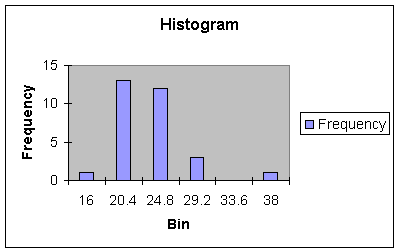
Note that the 38 lies outside and to the right
of the range and center of the data - it is called an outlier.
When outliers occur to the right of the range and center, we say the
distribution is skewed right. Generally, outliers are events
that are not created or expected from a process and should be removed
and investigated. In statistical process control, an outlier is
called a signal, and is an indication that a process is going
out of control and must be shut down and examined. Once the outlier
is removed, the histogram will return to its symmetric shape.
What happens if the June 1999 observation was an unexpected short
cycle time, such as 7 days. Look at the resulting Histogram in
Worksheet 1.2.4.
Worksheet 1.2.4
|
Bin |
Frequency |
|
7 |
1 |
|
11 |
0 |
|
15 |
0 |
|
19 |
9 |
|
23 |
16 |
|
27 |
4 |
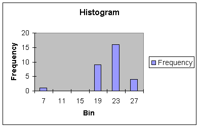
This histogram shows an outlier or signal event
to the left of the range of the data. When outliers occur to the left
of the range and center, we say the distribution is skewed
left.
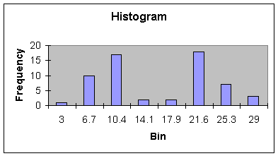
Bi-Modal
Shape
The next histogram, Worksheet 1.2.5, shows two distinct bell-shaped
distributions, one with a center at about 10, the other between 21
and 22. The histogram would suggest that two processes are actually
in the set of data - perhaps a set of data representing a process
before improvements were made (center at 21.6 days), and one set of
data representing a process after improvements were made (center at
10 days). This is a very common phenomenon in business. For example,
in season variables may have much higher values than off season. As
we will see in Modules 3 and 4, these type of Bi-Modal, or even
multi-modal distributions should be separated or stratified before
analysis of the data.
Worksheet 1.2.5
Bin Frequency 3 1 6.7 10.0 10.4 17.0 14.1 2.0 17.9 2.0 21.6 18.0 25.3 7.0 29 3
There are some numerical summary measures that help us measure shape.
These will be introduced in Module 1.3. The histogram is the third
item required in your analysis of data for Project Assignment 1.
Pause and ReflectPictures, such as histograms, quickly communicate information about the center, spread and shape of distributions so that we begin to know about the underlying process that generates the data. This is true whether we are describing data from a population of interest, or data in a sample drawn from a population.
Reference:
Anderson, D., Sweeney, D., &
Williams, T. (2001). Contemporary Business Statistics with Microsoft
Excel. Cincinnati, OH: South-Western, Chapter
2.
|
|
|
|