|
"Present and Describe Linear Relationships" |
Index to Module Two Notes |
|
"Present and Describe Linear Relationships" |
Index to Module Two Notes |
Regression analysis involves the study
of the form and direction of the relationship between
two or more variables. The main purpose of regression analysis is to
predict the value of a dependent or response
variable based on values of the independent or
explanatory variables. Simple linear regression analysis
involves the study of the linear or straight-line relationship
between two numerical variables: the dependent variable and
one numerical explanatory variable.
Correlation analysis involves the study of the strength
of the relationship between two variables. A supporting role of
correlation analysis is to discover those explanatory variables that
are strongly related to the response variable to improve the
predictions made. For example, suppose we want to predict the number
of hours it would take to perform an audit on a client. One
explanatory variable might be be the dollar amount of client assets.
Another explanatory variable might be the number of employees. After
gathering and analyzing data we discover that the correlation between
hours and assets is much higher than between hours and employees. In
this case, we would be better off using assets as the explanatory
variable.
This set of module notes introduces techniques for presenting and
describing simple linear regressions and correlations. Module 2.2
Notes describe how we test linear regressions for statistical
significance and practical utility, and how the linear regression
model can be used for prediction. The outline of steps to conduct a
complete simple linear regression and correlation analysis
is:
1. Hypothesize the regression model relating the dependent and independent variables.
2. Gather data and describe the form and direction of the relationship with a scatter diagram.
3. Estimate the regression model parameters and the correlation coefficient.
4. Test the practical utility of the regression model.
5. Test the statistical utility of the regression model.
6. Evaluate the assumptions of the regression model.
7. Use model for prediction.
This set of module notes will carry us through
Steps 1 through 3 above. Module 2.2 Notes will cover Steps 4 through
7. In Module 3 we will expand this model to consider the relationship
between the dependent variables and multiple independent variables,
including nonlinear terms and categorical variables.
Step 1: Hypothesize the
Regression Model Relating the Dependent and Independent Variables
The dependent or response variable,
identified by the symbol Y, is the variable we wish to predict. The
independent or explanatory variable, identified by the symbol X, is
the predictor variable. In simple linear regression, we propose the
following population straight-line model relating Y and X:
Eq. 2.1.1: Y = B0 + B1X + e, where:Y = Dependent Variable
X = Independent Variable
B0 = Y Intercept=mathematical value of Y when X=0note: Unless there are X values of 0, the Y intercept has no practical interpretation, just a mathematical interpretation as we will see later with an example.B1 = Slope = the amount of increase in Y (or decrease if
B1 has a negative sign) when X increases one unit .e = Random error
For a particular observation, for example the "ith" observation, this equation becomes:
Eq. 2.1.2: Yi = B0 + B1Xi + ei
This equation implies that each observation in a set of data has an actual Y value, an X value, a predicted Y value, and error which is the actual Y value minus the predicted Y value. In regression analysis, one of our objectives is to select those predictor variables that result in as little error as possible, recognizing there will always be some error in prediction. This equation is often referred to as the probabilistic model relating Y to X. The deterministic model is just the straight-line or prediction part without the actual value of Y and its error:
Eq. 2.1.3: E(Y) = B0 + B1X, whereE(Y) = Expected Value of Y
In step two, we will fit a straight-line model
based on sample data to estimate the above simple linear regression
equation. Assets ExtHours 3200 700 3000 900 3500 800 4000 900 4700 880 5000 850 6000 1000 5500 1000 6500 950 6500 1100 7000 1200 4500 830 7500 1100 5750 1100 7250 1160 8000 1120 8000 1300 8500 1400 9000 1500 8500 1200
That's enough theory. Let's go to step two, look at some data, and
create the scatter diagram.
Step 2: Gather Data and Describe
the Form and Direction of the Relationship with a Scatter Diagram
The example to illustrate simple linear
regression analysis is about a audit company - that is, a company
that is in the business of performing financial audits. This company
maintains a very small internal workforce and thus relies of external
auditors to perform client audits. The company would like a model to
predict the number of external audit hours it would need to contract
in order to do an audit. Such a model would be very helpful in
budgeting and planning. Management believes that a good predictor
variable would be client assets. In order to build the model, a
sample of data must be gathered.
Worksheet 2.1.1 shows the result of the
sample. The first column, Assets, are values of the independent
variable (this is the X variable) in thousands of dollars. The second
column, ExtHours, contains values of the dependent variable (this is
the Y variable) in hours. So, the first row of numbers represents an
audit completed in the past for a client with assets of $ 3,200,000.
The audit company had to contract for 700 external hours to perform
the audit. Note that in regression analysis, every observation has
two values, an X value and a Y value.
Worksheet 2.1.1
In the Assignment section of the Main Module 2 web
page, you will see that the first item for Assignment 2 is entering
the X and Y data in an Excel Spreadsheet. Hopefully, you can think of
a good response variable from your work , service or home
environment. Perhaps you would like to predict profit contribution,
sales, or salary, or hours to complete a task. Once you determine
what you would like to predict or understand, then pick a variable
that you think explains or predicts your response variable. Perhaps
labor cost is a good X (cost driver) to predict profit contribution
(Y). Perhaps years of experience is a good X variable to predict
salary (Y). Once you select your X and Y variables, try to collect 50
observations. In regression and correlation analysis, an observation
involves an X and a Y value. For example, sales in month 1 were 334
units. Here, 1 is the value for X and 334 is the value for Y for the
first observation. Another example, an employee in the database earns
$50,000 (the value of Y for this sample observation) and has worked
for 22 years (the value of X for this sample observation). Fifty
observations is more than the minimum required, so you can get by
with less if you have to. The minimum required for a two-variable
regression model is 20 observations (10 observations per variable).
The next task is to create the scatter diagram.
In regression analysis, the scatter diagram is used to plot
the independent variable on the X or horizontal axis, and the
dependent variable on the Y or vertical axis. To produce a scatter
diagram, highlight the X and Y data columns including the column
titles. Then select the Chart Wizard on the Standard Toolbar, then XY
Scatter, then respond to the dialog screen questions. It will take a
couple of tries to get the hang of making scatter diagrams; but after
some practice you should be able to replicate the scatter diagram
shown in Worksheet 2.1.2. In Assignment 2, the second item is for you
to create a scatter diagram.
Worksheet 2.1.2.
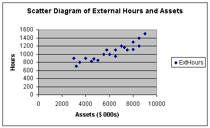
Note that as I was going through the dialogue boxes, I used the
opportunity to label the X and Y axis's, as well as give the diagram
a title. This scatter diagram shows a positive form of
relationship between X and Y, meaning that when X increases, Y
increases. It appears that when X increases, Y increases at a
constant rate, meaning that the form of the relationship is
linear.
A comment on page presentation. If you click on File on the
Standard Toolbar, then Print Preview, you can see where the
scatter diagram will appear on the worksheet page. If you want to
move it, just click on any part of the white area of the diagram and
click and drag the chart. If you want to change the shape of the
chart, click on the chart again and note the squares along the
borders of the chart. If you click and drag on the middle squares you
can make the chart wider, narrower, longer or shorter. Note finally
that when you click on any chart, the word Data changes to
Chart on the Standard Toolbar so you can switch between data
functions and chart functions.
Let's summarize what we have learned thus far. Regression analysis
includes the study of the form and direction of the relationship
between dependent and independent variables. In this case, we have
one dependent (Y) and one independent variable (X). The form
of a relationship can be linear or curvilinear. The form in Worksheet
2.1.2. above happens to look like a linear relationship. Worksheet
2.1.3 illustrates a curvilinear relationship.
Worksheet 2.1.3
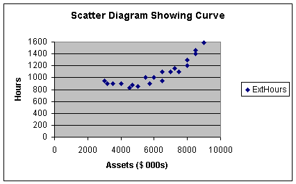
Note with the curvilinear relationship, as assets increased
initially, external audit hours remained relatively constant up to
clients with assets of approximately $5,000,000. Then it appears that
external hours increase at a slightly increasing rate from $5,000,000
to $9,000,000. We will see in Module 3 that this is curvature: Y
increases at an increasing rate as X increases. Curvature also
occurs when Y increases at a decreasing rate as X
increases.
Before continuing with the example, let's summarize the
direction component of the relationship. Our example in
Worksheet 2.1.2 shows a positive direction. Worksheet 2.1.4 shows
what a negative direction would look like.
Worksheet 2.1.4
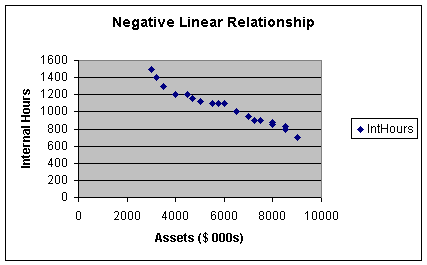
In this worksheet, as assets increase, internal hours decrease: this
describes a negative relationship between X and Y.
Pause and Reflect
To describe the relationship between two variables, we look at the form (linear or curvilinear) and the direction (positive or negative) of the relationship. Linear form means that as X increases, Y increases or decreases at a constant rate. Positive direction means that Y increases when X increases; and negative direction means that Y decreases when X increases.
The last component of the relationship between
two variables is strength. We will talk about measuring strength in
Step 3, as we need some numbers to do that.
Step 3: Determine the Simple
Linear Regression Equation and Correlation Coefficient
Regression Coefficients
Our next step is to find values for b0 and b1
in the following simple linear regression equation:
Eq. 2.1.4: y = b0 + b1x
This equation, based on sample data, is used to
estimate the hypothesized population Eq. 2.1.3. Note I have made all
of the symbols lower case to distinguish the sample equation from the
population equations shown as Eq. 2.1.1. - Eq. 2.1.3. Some texts put
hats ( ^ ) on the symbols in Eq. 2.1.4 to distinguish the sample
equation from the population model. Our task is to estimate numerical
values for the intercept, b0, and the slope,
b1. These are called the regression parameters in the
simple linear regression equation (the equation is also known as the
least squares regression equation or the trend equation or simply the
regression).
If you were a careful artist, you could take a ruler and draw a
straight-line as close as possible to every point in Worksheet 2.1.2.
Then, extend the left end of that line to the Y axis. The y value at
the point where an extension of the line touches the Y axis is called
the intercept, the value of y when x equals zero. Next, anywhere on
the line, draw a horizontal line one unit long in the X direction.
Now draw a vertical line to the regression equation. The length of
the vertical line divided by the length of the horizontal line
represents the amount of change in Y for the unit change in X. This
is called the slope of the line. Don't be alarmed - we will let
the computer do the "line drawing" to estimate the slope and the
intercept - I just wanted to go over the concept.
Actually, the computer uses mathematics to solve equations to
determine the value of the slope and intercept. The technique is
called the least squares method of regression. It essentially
involves trying to minimize the error (actual value of Y minus the
predicted value of y) in the equation Sum (Y - y)2. To let
Excel do the work, first make a copy of the scatter diagram to
preserve the original. To copy the diagram, put the cursor anywhere
in the white area of the the scatter diagram chart. When you click
the left mouse button, the chart becomes highlighted (small squares
or handles appear around the border of the chart). Now select
Edit on the Standard Toolbar and Copy from the pulldown
menu. Now move the cursor, select a new cell of the worksheet, and
select Edit on the Standard Toolbar and Paste from the
pulldown menu. You should get another copy of the scatter
diagram.
Now select (highlight) the copy of the scatter diagram by clicking
anywhere on the white chart surface and select Chart on the
top menu bar. Note that this menu bar has the word Data
instead of the word Chart unless you have highlighted a chart,
such as the scatter diagram. Next select Add Trendline from
the pulldown menu and you will get a dialog box. The default Linear
trend/regression is what we want. Before selecting OK, select
the Options Tab. Then select Display Equation and
Display R-Square. You should get Worksheet 2.1.5, as shown
below.
Worksheet 2.1.5
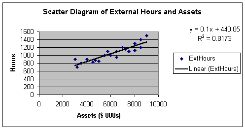
The least squares regression equation, or simply, the linear
regression equation, is shown as:
Eq. 2.1.5: y = 440.05 + 0.1x, since y is ExtHours and x is Assets,ExtHours = 440.05 + 0.1(Assets).
After we finish Steps 1- 6, we will use this equation to make a prediction. To jump ahead, what if we want to predict the hours it will take to audit a company with $6,000,000 in assets. Looking at the Worksheet 2.1.5 regression line, if we go straight up from 6000 on the X axis, we touch the line at a y value a little over 1,000 hours. To be more accurate, we can substitute 6000 into Eq. 2.1.5 and get:
Eq. 2.1.6: y = 440.05 + 0.1 (6000) = 440.05 + 600 = 1040.05.
Note carefully that I substituted 6000 into Eq.
2.1.6 rather than 6000000 since the original data was entered in
thousands.
However, before we use the equation for prediction we have to test
it's practical and statistical utility (Steps 4 and 5). For now,
let's be sure we understand how to interpret the equation. The
intercept is 440.05. This means that the value of y (External
Hours) is 440.05 when x (assets) equals zero. Now this is really just
a theoretical point helpful in placing the equation on the scatter
diagram. It is theoretical without practical value because we did not
have any x (asset) values equal to zero in the original data. Some
suggest that the intercept is like a fixed value - what we need to
get started without any value for x at all. But to know this, we
would have had to include observations where x in fact equals zero.
Otherwise, we are just guessing. In fact, an ethical
caution in regression is not to interpret the results of
regression models outside of the range of the original data.
Now let's look at the slope, which is 0.1. The slope is
interpreted as follows: y (External Hours) is predicted to
increase 0.1 when x (assets) increase by one. To make this a bit more
practical, we can say that External Hours increase by 0.1 when Assets
increase by $1,000 (since our data was is in thousands of dollars, 1
unit of x is equal to $1,000). Since the relationship is linear and
the coefficients are proportional, we can also say that external
hours increase by 1 when assets increase by $10,000; or external
hours increase by 10 when assets increase by $100,000; or external
hours increase by 100 when assets increase by $1,000,000. Now we have
something! The firm should plan on 100 more external hours for every
increase of $1,000,000. Caution as before: this interpretation
only applies within the range of our data. We don't know what the
slope is above $9,000,000 since we did not have any observations
above $9,000,000. We do not extrapolate beyond the range of our data
when making interpretations.
Pause and Reflect
The intercept in the regression equation is the value of y when x equals zero. It has no practical interpretation unless the regression model was built on data where some of the values of x were zero. The slope of the regression equation indicates the predicted change in y (increase if the slope is positive; decrease if the slope is negative) for a one-unit increase in x.
Regression equations are the most widely used
statistical tools in business since they can be used to predict the
value of a response variable, such as sales, based on a predictor
variable. We discussed form and direction as important
aspects of the relationship between the two variables. The
strength of the relationship between two variables is also an
important aspect to know about in business.
Correlation Analysis
Recall earlier that we said correlation analysis is used to
measure the strength of the linear relationship between two
quantitative variables. To find the correlation coefficient, we begin
with the coefficient of determination, R2.
Look back at Worksheet 2.1.5 and note the R2 = 0.8173 or
0.82 on the scatter diagram. R-Square, or R2, is the
symbol for the coefficient of determination. We will see its math
later. For now, the interpretation of R2 is simply the
amount of sample variation in Y that is explained by X. For my
example, we would say that client assets explain 82% of the sample
variation in external hours.
As you look at a scatter diagram you notice that the value of Y
changes or varies for different values of X. Strongly related
variables are those in which changes in X result in predictable
changes in Y. In other words, X is explaining a large percent of the
variation in Y. Weakly related variables, such as those with
R2 below 25%, suggest that changes in X do not result in
predictable changes in Y. We will have more to say about
R2 when we get to Step 4 in Module 2.2 Notes. I'll close
this brief introduction with the note that R2 should be as
close to 100% as possible in order for us to have models that are
practically useful. A good general benchmark is that R2
should be at least above 50%, although it should be noted that
specific industries/service sectors may have their own traditional
benchmarks for R2.
The correlation coefficient, r, is the statistic commonly used to
report the strength of a linear relationship between two variables.
In fact, the word has crept into common English usage when we say
something like, "there is a high correlation between how much I study
and my GPA" (at least I hope we say something like that!). The
correlation coefficient is simply the square root of R2.
For this example, r = +0.904.
This r of +0.904 represents a strong, positive, linear relationship
between client assets and external hours. How do I get the
direction? By looking at the sign on the slope coefficient. If
the sign is positive, r is positive, and vice-versa. Worksheet 2.1.4
shows a relationship in which the r would have a negative sign. How
do I get the measure of strength? That one is tougher but here
are some benchmarks that are common in general business/service
sectors (you may find different benchmarks in medical practice,
psychology, and specific industries/service sectors, and so forth):
r = -0.9 (and below): Strong negative linear relationship-0.7: Moderate negative linear relationship
-0.5: Weak negative linear relationship
+0.0: No relationship
+0.5: Weak positive linear relationship
+0.7: Moderate positive linear relationship
+0.9 (and above): Strong positive linear relationship
There are two cautions with using the correlation coefficient. First,
we can say that X and Y are strongly related, which implies that
changes in X result in predictable changes in Y. But unless we do an
experiment, we are cautioned against saying that X causes Y
from an ethical perspective. Think about examples of this. The r
between consumption of the alcohol beverage Scotch and donations to
charitable organizations is very high, such as above a positive 0.90.
We would not say that such consumption causes donations to increase,
or reduced consumption causes donations to decrease because the
causation variable is probably disposable personal income. When DPI
goes up, donations and consumption go up. That being said, we can
still rely on the value of r to select variables that have an impact
or result in a change in Y, without having to do an experiment. That
is, marketing executives in the Scotch industry can still pattern
sales projections off projections of aggregate donations to
charitable organizations - to make predictions, you do not have to
prove causation.
The second caution is to remember that r explains the strength of
linear relationships. Look at the following example in Worksheet
2.1.6.
Worksheet 2.1.6
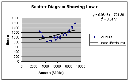
The R2 here is only 35%; meaning that client assets now
only explain 35% of the sample variation in external hours. This
gives an r of +0.59, which borders on a weak relationship. In
actuality, the relationship between client assets and external hours
is indeed strong - but the strength lies in the curvilinear
relationship between the two variables, not the linear relationship.
More on that in Module 3. For now, just recognize that many people
misapply the correlation coefficient to models that have curvilinear
rather than linear form.
A closing comment on correlation analysis. Since r is dimensionless
and varies between -1 and +1, it can be thought of as a
standardized measure of the strength of the linear
relationship between two variables. Related to the correlation
coefficient is covariance, a non-standardized measure of the
strength of the linear relationship between two variables. The
covariance is computed by multiplying the correlation coefficient by
the product of the standard deviations of the two variables, thus
mathematically defining the relationship. While the correlation
coefficient is the more commonly used measure of the strength of the
linear relationship between two variables, financial models such as
used in portfolio theory incorporate covariance so you may see that
statistic in a finance class.
Pause and Reflect
Steps 1 - 3 of regression and correlation analysis give us information about the form, direction and strength of the relationship between two variables. In simple linear regression and correlation analysis, it is assumed that the two variables are numerical and that the form of the relationship is a straight-line. While these may seem simplistic assumptions, many relationships in business and economics are modeled in this fashion.
This closes Module 2.1 Notes. You should be
able to get through Items 1 through 4 of Assignment 2 at this
point.
Outliers and Influential Variables
Before we go to Module Notes 2.2, let me illustrate one last caution
in Steps 1 - 3 that you may run into as you prepare for Assignment 2.
Recall that we relied on the histogram in Module 1 to identify
outliers to the distribution under examination. We can also have
outliers in regression analysis. Let's look at a modified scatter
diagram in Worksheet 2.1.7.
Worksheet 2.1.7
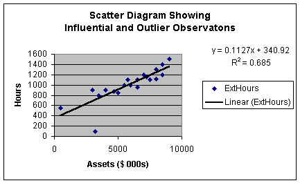
This scatter diagram is similar to that in Worksheets 2.1.2 and 2.1.5
except that I changed the value of two of the observations. The
observation with assets of just over $3,000,000 and external hours of
100 is well below the regression line. This would lead us to expect
that it is an outlier to the regression model. When we get to
Module Notes 2.2, we will look at a way to precisely determine if
that observation is an outlier or not. We use the same rules as
before - if an observation is more than 3 standard deviations from
the regression line, it is an outlier.
There is one other observation that appears apart from the data. It
is the observation with a value of fewer than 600 external hours and
less than $1,000,000 in assets. While this observation is separated
from the data, it is quite close to the regression line. Thus, it is
not an outlier to the regression model. However, since the point is
separated from the data, we call it an influential
observation. As in our study of descriptive statistics for individual
variables in Module 1, outliers and influential variables should be
identified and removed from the data set prior to numerical analysis.
As before, sometimes outliers and influential observations suggest a
need to stratify the data before further analysis; sometimes outliers
and influential observations are just individual events (sometimes
even input errors!) that should be removed before further
analysis.
Reference:
Anderson, D., Sweeney, D., &
Williams, T. (2001). Contemporary Business Statistics with Microsoft
Excel. Cincinnati, OH: South-Western, Chapter 3 (Section 3.1) and
Chapter 12 (through Section 12.8).
|
|
|
|