|
Module
1.2 Notes |
|
Index to Module One Notes
|
This section of Module 1 will
get us into Microsoft Excel, and take us to the point of creating a histogram
summary of numerical data. Table 1.2.1 shows two and a half years of cycle time
data from the manufacturing firm introduced in Module 1.1 Notes.
Table 1.2.1
|
|
1997 |
1998 |
1999 |
|
January |
19 |
20 |
21 |
|
February |
21 |
22 |
21 |
|
March |
20 |
19 |
29 |
|
April |
16 |
20 |
25 |
|
May |
18 |
23 |
21 |
|
June |
23 |
19 |
29 |
|
July |
22 |
27 |
|
|
August |
24 |
22 |
|
|
September |
17 |
18 |
|
|
October |
26 |
20 |
|
|
November |
20 |
19 |
|
|
December |
21 |
18 |
|
Enter this data into a single
column in a Microsoft Excel spreadsheet. For some extra practice with Excel
features, you can place this column to the right of a column for Month/Yr, as
shown in Worksheet 1.2.1. For example, I placed the months of the years in
column A. Thus, column A, row 1 (cell A1), has the title and the specific
months go from cell A2 to A31. In Microsoft Excel 98 and 2000, the default
format for month/year is Mon-XX. So, when I typed January 1997 in Cell A2, and
hit the enter key, Jan-97 appeared (you can change the default format of
any cell by selecting Format on the Standard Toolbar, then Cells
from the pulldown menu, then the Number tab, then whatever format is
desired from the available list). Now, if you select cell A2, note a small
square in the lower right of the highlighted cell border. Click and drag that
square down to cell A31 and all of the months/years will enter successively -
slick, huh?!
Cell B1 has the title for the variable "Time," and the data is
entered from cell B2 to B31. There is no magic way of entering the data for the
variable "Time" in column B, at least not until I get voice data
entry capability. Of course, the typical FGCU MBA student has data entry
employees who can do this for them at work - right?!!
An aside: if you have any questions about Excel as we go through the course,
please e-mail/call me so we can get them resolved quickly. Another option for
questions: I find the Excel Help feature getting better and better with each
version, but it is getting so big that you seem to need basic search engine
skills to locate your topic quickly.
I then copied the Time column into Column C and re-titled it
"Sorted." One way to copy a range of data: select or highlight cells
B1 to B31 by clicking on B1, then dragging to B31, select the Copy Icon
on the Formatting Toolbar, select or highlight Cell C1, and click the Paste
Icon on the Formatting Toolbar. Sort the data from lowest to highest by
selecting or highlighting Cells C1 to C31, then click on the Sort
Ascending Icon (A to Z) on the Formatting Toolbar. Note that his technique
sorts the data in rows based on the content of one column. To sort the data in
rows based on contents of two or more columns, select the rows and columns of
your data range, click on Data on the Standard Toolbar, select Sort
from the pulldown menu, and then follow the dialog screen entry instructions.
Did you replicate the columns in Worksheet 1.2.1? If not, you should e-mail or
phone me for help. If so, save your work to a file before going on. Assignment
1 requires entry of your data, copying to a separate column, then sorting the
duplicate column of data (Items 1 and 2 of Project Assignment 1).
Worksheet
1.2.1
|
Month/Yr |
Time |
Sorted |
|
Jan-97 |
19 |
16 |
|
Feb-97 |
21 |
17 |
|
Mar-97 |
20 |
18 |
|
Apr-97 |
16 |
18 |
|
May-97 |
18 |
18 |
|
Jun-97 |
23 |
19 |
|
Jul-97 |
22 |
19 |
|
Aug-97 |
24 |
19 |
|
Sep-97 |
17 |
19 |
|
Oct-97 |
26 |
20 |
|
Nov-97 |
20 |
20 |
|
Dec-97 |
21 |
20 |
|
Jan-98 |
20 |
20 |
|
Feb-98 |
22 |
20 |
|
Mar-98 |
19 |
21 |
|
Apr-98 |
20 |
21 |
|
May-98 |
23 |
21 |
|
Jun-98 |
19 |
21 |
|
Jul-98 |
27 |
21 |
|
Aug-98 |
22 |
21 |
|
Sep-98 |
18 |
22 |
|
Oct-98 |
20 |
22 |
|
Nov-98 |
19 |
22 |
|
Dec-98 |
18 |
23 |
|
Jan-99 |
21 |
23 |
|
Feb-99 |
21 |
24 |
|
Mar-99 |
29 |
25 |
|
Apr-99 |
25 |
26 |
|
May-99 |
21 |
27 |
|
Jun-99 |
21 |
29 |
Now it's time to create a
histogram to summarize the data in a picture. As we will see, the histogram
tells us something about the center of the data, the spread of the data, and
the shape of the data.
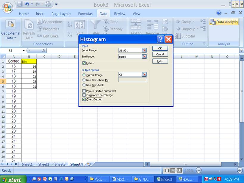
The fastest way to create a histogram is to use the Data Analysis Histogram
Tool. To do this, you have to activate the Data Analysis Add-In feature of
Excel. Select Tools on the Standard Menu Bar and check to see if Data
Analysis is available on the pulldown menu. If not, select Add-Ins
and the Add-Ins dialogue box will appear. Select the Analysis ToolPak
check box. Click OK and exit Excel (CAUTION: Save your Excel File
before exiting). When you open Excel, the Data Analysis Add-In feature
should be available through the Tools pulldown menu on the Standard Toolbar.
Excel 2007 is slightly different. In Excel, go to top left Windows icon and
click it once. At the bottom of the
pop-down window click Excel Options. In
the left column, select Add-Ins. On the
right box, select Analysis Toolpak. Click on GO button at the bottom of
window. When the Add-Inns windows popup,
check the square for Analysis Toolpak and then OK. To confirm, go to the DATA tab in Excel. You should have a DataAnalysis menu window. For a demonstration on how to install the
Add-in feature in Excel 2007, select this link.
If the Analysis ToolPak selection is not available in the Add-Ins, the Data
Analysis component was probably not included when your copy of Excel was
installed on your computer. Select Help on the Standard Toolbar, then
select Microsoft Excel Help in the pulldown menu, select the Index
tab, type keyword "Installation," select Search, and then
select Install or Remove Individual Features, and follow the
instructions. The Data Analysis component allows Excel to be somewhat
competitive with statistical software packages. The component doesn't have the
full functionality of software packages such as Minitab, SPSS or SAS, but it
has the features commonly used in business applications... and these are on a
spreadsheet used by most of the world.
After you have activated this important "Add In" that we will be
using throughout this course, create a histogram. To do this, select Tools
on the Standard Toolbar, then Data Analysis from the pulldown menu and
respond to the dialog screen. I entered C1:C31 for the input range and checked Label
in the Label Checkbox. This means that the first cell of my data range actually
is a title rather than a data entry. If I would have entered C2:C31 for the input
range, I would not have checked Label (if you are like me, you will make
this mistake several times before you get the hang of Excel Data Analysis
dialog screens). Skip bin range to let the software create a default set of
frequency bars for the histogram. I like to put the histogram on the same page
as my data so I select Output Range, then put the cursor in the
rectangle next to
Worksheet 1.2.2
|
Bin |
Frequency |
|
16 |
1 |
|
18.6 |
4 |
|
21.2 |
15 |
|
23.8 |
5 |
|
26.4 |
3 |
|
More |
2 |
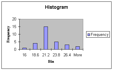
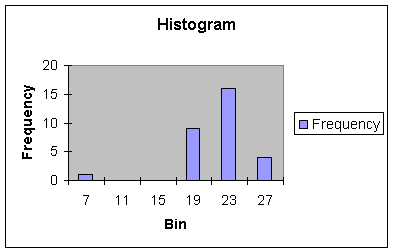
The bins of the histogram
represent a convenient way of summarizing the data by showing the frequency
of observations at preselected intervals - the family name given to this type
of chart then, is the frequency distribution. The histogram shows one
observation in the Bin labeled 16. Next, there are 4 observations in the Bin
with a value of 18.6 (observations with values of 17, 18, 18, and 18). This
means that in the interval of numbers greater than 16 and less than 18.6 there
are four numbers: 17, 18, 18, and 18. Likewise, there are 15 numbers in the
interval of numbers greater than 18.6 and less than 21.2, and so forth. The bin
labels are the upper limits of each class interval chosen by Excel.
How did Excel determine the interval of each bin should be 2.6? It's fairly
simple, actually (you can skim this and the next paragraph if you want to go
directly to interpretation of Center and Spread below). First, Excel computes
the range of the data: highest number minus the lowest number = 29 - 16
= 13. Next, Excel divides the range by the number of intervals or bars
desired to summarize and display the data. The default number of intervals is
5, so 13 divided by 5 gives a class interval range of 2.6. Now Excel divides
the numbers 16 through 29 into five class intervals, each with a range of 2.6.
- The
first interval includes the numbers < 16 (there is one 16)
- The second interval includes numbers > 16 to 18.6
- The third interval includes the numbers > 18.6 to 21.2
- The fourth interval includes the numbers > 21.2 to 23.8
- The fifth interval includes the numbers > 23.8 to 26.4
- The last interval is titled "More" by Excel: and includes all the
numbers above the last upper limit (26.4 in this case) for placing in an extra
"bucket" or bin.
Some notes on the location and shape of the chart: What if you do not like the location of the histogram? Select the histogram by pointing and clicking anywhere on the white area of the chart. You should see 8 small squares called "handles" around the border of the chart. Now, click again anywhere on the white area of the histogram and drag the chart wherever you wish. You can also change the shape of the histogram. Point and click on the middle handle on the left border and drag to the left to make the histogram longer to the left, or drag into the histogram to make it smaller - you can do the same to the right side. Point and click on the middle handle of the top border and drag up to make the histogram wider to the top - same for the bottom. If you point, click and drag a handle on the corner, the histogram gets larger if you drag out, or smaller if you drag in. If you point and click on the histogram, select File on the Standard Toolbar, and Print, you can print just the histogram. If you do not point and click on the histogram and select File and Print, you can print the histogram and whatever else is on the worksheet, such as the data. I like to select File and Print Preview to see where the page borders are to determine if I have to move the histogram so it doesn't get cut up when printing.
Creating a histogram is
sometimes considered more "art" than "science." We are
trying to develop a picture that best illustrates the center, spread and shape
of the data distribution to communicate information about the underlying
process. More intervals provide greater detail at the expense of losing the
identification of the process center. Fewer intervals provide a more concise
summary at the expense of losing the identification of the process shape. Excel
does a very good job at creating the histogram as long as there is are at least
30 observations. You can change the number of intervals, the bin labels, and
the frequency count by manipulating the Bin and Frequency cells of the
frequency table that accompanies each histogram. A rule of thumb for the number of classes is
between 5 and 15 classes.
In certain applications, you want
to create a histogram with specific class limits for easier interpretation of
the data (for example, you may not want to show decimal points, or you are
interested in partitioning the data into specific income groups). First input class limits in a block of cells
called Bin, for example 16 in cell B2, 19 in cell B3, etc (see figure 1.2.1
below). Second, in the Histogram pull
down window, input this range into the ‘Bin Range’. Excel creates a histogram with your desired
class limits as indicated in Worksheet 1.2.2.1
Figure 1.2.1
Worksheet 1.2.2.1
|
Bin |
Frequency |
|
16 |
1 |
|
19 |
8 |
|
22 |
14 |
|
25 |
4 |
|
28 |
2 |
|
More |
1 |
The first interval includes
the numbers < 16 (there is one 16)
- The second interval includes numbers > 16 to 19
- The third interval includes the numbers > 19 to 22
- The fourth interval includes the numbers > 22 to 25
- The fifth interval includes the numbers > 25 to 28
- The last interval is titled "More" includes all the numbers above
the last upper limit (28 in this case).
The
Center and Spread of a Set of Data
We can see that the
center of the data appears at about 21, and the spread is from 16 to
"More." You can change "More" to 29 where 29 is the highest
number in the data set by typing 29 over the word "More" in the
frequency table next to the histogram. This would then allow the reader to see
that the spread of the data is from a low of 16 to a high of 29. Exact
numerical measures of the center and spread of the data will be introduced in
Module 1.3.
The
Shape
One other thing we get from the histogram is the shape - the shape shown in
Worksheet 1.2.2 is a symmetric bell-shaped distribution called the Normal
Probability Distribution. The histograms of many distributions appear like
this, especially if the continuous data in a sample under study is randomly
selected, without bias to very high or very low numbers, and without multiple
processes mixed together. I will illustrate the effects of very high or very
low numbers next.
Suppose for a moment that the last observation (Jun 99) was 38 days rather than
29 days. Now look at the histogram in Worksheet 1.2.3.
Worksheet 1.2.3
|
Bin |
Frequency |
|
16 |
1 |
|
20.4 |
13 |
|
24.8 |
12 |
|
29.2 |
3 |
|
33.6 |
0 |
|
38 |
1 |
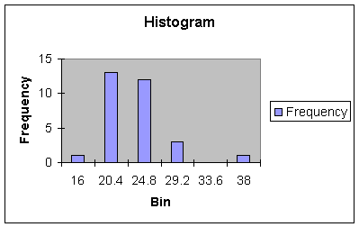
Note that the 38 lies outside
and to the right of the range and center of the data - it is called an outlier.
When outliers occur to the right of the range and center, we say the
distribution is skewed right. Generally, outliers are events that are
not created or expected from a process and should be removed and investigated.
In statistical process control, an outlier is called a signal, and is an
indication that a process is going out of control and must be shut down and
examined. Once the outlier is removed, the histogram will return to its
symmetric shape.
What happens if the June 1999 observation was an unexpected short cycle time,
such as 7 days. Look at the resulting Histogram in Worksheet 1.2.4.
Worksheet 1.2.4
|
Bin |
Frequency |
|
7 |
1 |
|
11 |
0 |
|
15 |
0 |
|
19 |
9 |
|
23 |
16 |
|
27 |
4 |
This histogram shows an
outlier or signal event to the left of the range of the data. When outliers
occur to the left of the range and center, we say the distribution is skewed
left.
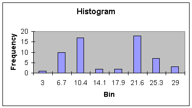
Bi-Modal
Shape
The next histogram, Worksheet 1.2.5, shows two distinct bell-shaped
distributions, one with a center at about 10, the other between 21 and 22. The
histogram would suggest that two processes are actually in the set of data -
perhaps a set of data representing a process before improvements were made
(center at 21.6 days), and one set of data representing a process after
improvements were made (center at 10 days). This is a very common phenomenon in
business. For example, in season variables may have much higher values than off
season. As we will see in Modules 3 and 4, these type of Bi-Modal, or even multi-modal
distributions should be separated or stratified before analysis of the data.
Worksheet 1.2.5
|
Bin |
Frequency |
|
3 |
1 |
|
6.7 |
10.0 |
|
10.4 |
17.0 |
|
14.1 |
2.0 |
|
17.9 |
2.0 |
|
21.6 |
18.0 |
|
25.3 |
7.0 |
|
29 |
3 |
There are some numerical summary measures that help us measure shape. These
will be introduced in Module 1.3. The histogram is the third item required in
your analysis of data for Project Assignment 1.
Pause and Reflect
Pictures, such as
histograms, quickly communicate information about the center, spread and shape
of distributions so that we begin to know about the underlying process that
generates the data. This is true whether we are describing data from a
population of interest, or data in a sample drawn from a population.
To
complete this module notes, you can watch instructional videos on how to build
Histograms with Excel through these 2 links:
1) http://ruby.fgcu.edu/courses/ekirche/jing/fa09/histogram.swf
2)
http://ruby.fgcu.edu/courses/ekirche/jing/fa09/histogram2.swf
Sampling
Concepts & Procedures
The backbone
of statistical analysis entails understanding the extent to which the sample
accurately represents the whole population.
Many interesting and potentially problematic issues arise in taking and
using samples, including bias, sample size too small, receiving dishonest
response to questions that may be controversial or sensitive. And we are not
just interested in the sample (or sample results); we really want information
about the whole population from which the sample came from. Randomness is key
component of obtaining a representative sample that reflects the
characteristics in the population. In
business, data usually arises from accounting transactions or management
processes (i.e., inventory, sales, and payroll). Much of the data we analyze were
recorded without explicit consideration, yet many decisions may depend on the
data. Let's go over some important
definitions before you collect the data for your assignments.
A subject or
individual is a single member of a collection of items that we want to
study. A variable is a characteristic of
a subject or individual such as employee’s income or invoice amount. A data set consists of all the values of all
the variables for all the individuals we have chosen to observe, that is, a
collection of observations. Table 1.1 relates the type of dataset with the
amount of variables you may want to study/present. In Asgn 1, for example, will
conduct a univariate study; that is, we are interested in describing a
process/construct through only one variable or characteristic process. As you may recall in my example for Module 1,
I am interested in measuring customer service which of course is composed of
many variables/characteristics (reliability, on time delivery, etc). However, I elected to present/describe it
only in terms of cycle time, which is viewed by management as very important
business characteristic to please our customers. Therefore, in Module 1, we'll
deal with univariate study.

Table 1.1
Module 2 will
study bivariate data through simple regression analysis. Modules 3, 4, and 5
will require the use of multivariate dataset.
Figure 1.1.4 illustrate a multivariate data set.
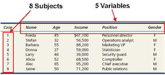
Figure 1.1.4
Sample or Census?
A sample
involves looking only at some items selected from the population. A census is an
examination of all items in a defined population. The census can be contrasted with sampling in
which information is obtained only from a subset of a population. Census data
is commonly used for research, business marketing, and planning as well as a
base for sampling surveys.
Situations
Where a Sample May Be Preferred …
·
Infinite
Population: No census is possible if the
population is infinite or of indefinite size (an assembly line can keep
producing bolts, a doctor can keep seeing more patients).
·
Destructive
Testing: The act of sampling may destroy or
devalue the item (measuring battery life, testing auto crashworthiness, or
testing aircraft turbofan engine life).
·
Timely
Results: Sampling may yield more timely results
than a census (checking wheat samples for moisture and protein content, checking
peanut butter for aflatoxin contamination).
·
Accuracy: Sample
estimates can be more accurate than a census.
Instead of spreading limited resources thinly to attempt a census, our
budget of time and money might be better spent to hire experienced staff,
improve training of field interviewers, and improve data safeguards.
·
Cost:
Even if it is
feasible to take a census, the cost, either in time or money, may exceed our
budget.
·
Sensitive
Information: Some
kinds of information are better captured by a well-designed sample, rather than
attempting a census. Confidentiality may also be improved in a carefully-done
sample.
Situations
Where a Census May Be Preferred …
·
Small
Population: If the
population is small, there is little reason to sample, for the effort of data
collection may be only a small part of the total cost.
·
Large
Sample Size: If the
required sample size approaches the population size, we might as well go ahead
and take a census.
·
Database
Exists: If the data
are on disk we can examine 100% of the cases.
But auditing or validating data against physical records may raise the
cost.
·
Legal
Requirements: Banks
must count all the cash in bank teller drawers at the end of each
business day. The U.S. Congress forbade
sampling in the 2000 decennial population census.
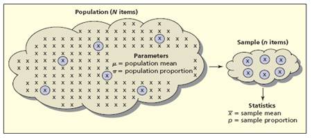
Pause and reflect: A parameter is any measurement that
describes an entire population. Usually, the parameter value is unknown since
we rarely can observe the entire population.
Parameters are often (but not always) represented by Greek letters
Figure
1.1.5
Statistics
are any measurement computed from a sample. Usually, the statistic is regarded as an
estimate of a population parameter. Sample
statistics are often (but not always) represented by Roman letters.
Let's review two situations in which samples provide estimates of
population parameters.
1. A tire
manufacturer developed a new tire designed to provide an increase in mileage over
the firm's current line of tires. To estimate the mean number of miles provided
by the new tire, the manufacturer selected a sample of 120 new tires for
testing. The test provided a sample mean of 36,500 miles. Hence, an estimate of
the mean tire mileage for the population of new tires was 36,500 miles
2. Members of
a political party were considering supporting a particular candidate for
election to the U.S. Senate, and party leaders wanted an estimate of the
proportion of registered voters supporting the candidate. The time and cost
associated with contacting every potential voter were prohibitive. Hence, a
sample of 400 registered voters was selected and 160 of the 400 voters
indicated a preference for the candidate.
An estimate of the proportion of the population of registered voters
supporting the candidate was 160/400 = 0.40.
These two examples illustrate why samples are used. It is important to
realize that sample results provide only estimates of the value of the
population characteristics. We do not expect the mean mileage for all tires in
the population to be exactly 36,500 miles, nor do we expect exactly 0.40, or
40%, of the population of registered voters to support the candidate. However,
proper sampling methods, the sample results will provide 'good' estimates of
the population parameters. Let's briefly
see some types of sampling procedures.
Sampling procedures:
·
Simple
Random Sample: Use random numbers to select items from a
list (e.g., VISA cardholders).
·
Systematic
Sample: Select every kth
item from a list or sequence (e.g., restaurant customers).
·
Stratified
Sample: Select
randomly within defined strata (e.g., by age, occupation, gender).
·
Cluster
Sample: Like
stratified sampling except strata are geographical areas (e.g., zip codes).
·
Judgment
Sample : Use expert
knowledge to choose “typical” items (e.g., which employees to interview).
·
Convenience
Sample : Use a sample
that happens to be available (e.g., ask co-worker opinions at lunch).
·
Focus
Groups : In-depth
dialog with a representative panel of individuals (e.g. iPod users).
A very important sampling procedure is called Simple
Random Sampling (SRS): Every item in the population of N items has the same chance of being chosen in the sample of n items. Thus, we rely on random numbers
to select a name.
Example:
There are 48 names in the list presented in figure 1.1.6 and we need to select
one at random. Each student is
associated with an ordinal number from 1 to 48. One simple way is to write each
number in individual papers and place them in a box to be blindly selected by
one person. Another way is to use random
tables (as presented in many statistical texts) that can be used to select a
random number. However, in this course we'll use Excel random number generators
to accomplish this task. The Excel
function
=RANDBETWEEN(bottom,top)
Returns a random integer number between the
numbers you specify. A new random integer number is returned every time the
worksheet is calculated (or F9 key is pressed).
Syntax:
=RANDBETWEEN(bottom,top)
Bottom: is the smallest integer RANDBETWEEN will
return.
Top: is the largest integer RANDBETWEEN will
return.
Example:
=RANDBETWEEN(1,100)
returns a random number between 1 and 100 (varies)
In our
example, by inserting the function =RANDBETWEEN(1,48) into a cell it returned the value 44. That
means Stephanie (associated with number 44) was randomly selected from her
class.
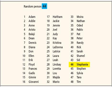
Figure 1.1.6
When the data
are arranged in a rectangular array (or Table), we can randomly select an item
by randomly selecting a row and a column.
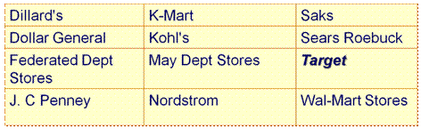
For example,
we want to randomly select a department store given in the table above with 3
columns and 4 rows. We use the function =RANDBETWEEN(1,3) function to randomly
choose a column, the return in Excel was 3, and =RANDBEWTEEN(1,4) to choose a row, the return in Excel was 3.
This way, each item has an equal chance of being selected. The final random
selection is column 3 and row 3, pointing to Target department store.
Often, we
have the need to randomize a List as indicated in Figure 1.1.7. The Excel function RAND() is very useful in
many situations to generate random numbers. It returns an evenly distributed
random real number greater than or equal to 0 and less than 1. A new random
real number is returned every time the worksheet is calculated or F9 key is
pressed.
Syntax:
=RAND( )
Remarks:
·
To
generate a random real number between a and b, use:
RAND()*(b-a)+a
·
=RAND()*100
A random number greater than or equal to 0 but less than 100 (varies)
If you want
to use RAND to generate a random number but don't want the numbers to change
every time the cell is calculated, you can enter =RAND() in the formula bar,
and then press F9 to change the formula to a random number.
In our
example, use function =RAND() beside each row to create a column of random
numbers between 0 and 1. Let's see an example.
|
Name |
Major |
Gender |
|
|
Claudia |
Accounting |
F |
|
|
Dan |
Economics |
M |
|
|
Dave |
Human Res |
M |
|
|
Kalisha |
MIS |
F |
|
|
LaDonna |
Finance |
F |
|
|
Marcia |
Accounting |
F |
|
|
Matt |
Undecided |
M |
|
|
Moira |
Accounting |
F |
|
|
Rachel |
Oper Mgt |
F |
|
|
Ryan |
MIS |
M |
|
|
Tammy |
Marketing |
F |
|
|
Victor |
Marketing |
M |
|
|
Rand |
Name |
Major |
Gender |
|
0,382091 |
Claudia |
Accounting |
F |
|
0,730061 |
Dan |
Economics |
M |
|
0,143539 |
Dave |
Human Res |
M |
|
0,906060 |
Kalisha |
MIS |
F |
|
0,624378 |
LaDonna |
Finance |
F |
|
0,229854 |
Marcia |
Accounting |
F |
|
0,604377 |
Matt |
Undecided |
M |
|
0,798923 |
Moira |
Accounting |
F |
|
0,431740 |
Rachel |
Oper Mgt |
F |
|
0,334449 |
Ryan |
MIS |
M |
|
0,836594 |
Tammy |
Marketing |
F |
|
0,402726 |
Victor |
Marketing |
M |
Figure 1.1.7
Now you sort
from in ascending order. The first n
items are a random sample of the entire list (they are as likely as any
others).
|
Rand |
Name |
Major |
Gender |
|
0,143539 |
Dave |
Human Res |
M |
|
0,229854 |
Marcia |
Accounting |
F |
|
0,334449 |
Ryan |
MIS |
M |
|
0,382091 |
Claudia |
Accounting |
F |
|
0,402726 |
Victor |
Marketing |
M |
|
0,431740 |
Rachel |
Oper Mgt |
F |
|
0,604377 |
Matt |
Undecided |
M |
|
0,624378 |
LaDonna |
Finance |
F |
|
0,730061 |
Dan |
Economics |
M |
|
0,798923 |
Moira |
Accounting |
F |
|
0,836594 |
Tammy |
Marketing |
F |
|
0,906060 |
Kalisha |
MIS |
F |
Systematic
Sampling: Sample by choosing every kth item
from a list, starting from a randomly chosen entry on the list. Systematic
sampling should yield acceptable results unless patterns in the population
happen to recur at periodicity k.
It can be used with unlistable or infinite populations. Systematic samples are well-suited to
linearly organized physical populations.
A systematic sample of n items from a population of N items
requires that periodicity k be approximately N/n. For
example, out of 501 companies, we want to obtain a sample of 25. What should
the periodicity k be? k = N/n , 501/25 » 20. So,
we should choose every 20th company from a random starting point.
For example, starting at item 2, we sample every k = 4 items to
obtain a sample of n = 20 items from a list of N = 78 items.
Note that N/n = 78/20 » 4.
That is all for now folks. Try to
apply some of these concepts when considering your data for the assignments in
this course. Remember that a good
sampling procedure helps eliminate bias and increase the chance of good
estimates of population parameters. We'll see more about sampling when we get
to module 5.
-x-x-x-x-x-x-
Reference:
Anderson,
D., Sweeney, D., & Williams, T. (2006). Essentials of Modern Business
Statistics with Microsoft Excel. Cincinnati, OH: 3rd edition, South-Western. Chapter 2.
D.
Groebner, P. Shannon, P. Fry & K. Smith.
Business Statistics: A Decision Making Approach, Fifth Edition,
Prentice Hall, Chapter 2
Ken
Black. Business Statistics for Contemporary Decision Making. Fourth Edition,
Wiley. Chapter 2
| Return to Module 1 Overview | Return to top of page |