|
Index to Module Two Notes
|
In Module Notes 2.1 we covered Steps 1 - 3 of regression and correlation analysis for the simple linear regression model. In those steps, we learn about the form, direction and strength of the relationship between two variables. We also identify potential outlier and influential observations that need to be removed from the data set for separate study. In Steps 4 - 6, we will determine if the relationship has practical and statistical utility and meets the regression assumptions. We will also learn a numerical process for identification of outliers. When everything checks out, we are then ready for Step 7, using the model for predictions. All seven steps are repeated below.
1. Hypothesize the regression model
relating the dependent and independent variables.
2. Gather data and describe the form and direction of the relationship with a
scatter diagram.
3. Estimate the regression model parameters and the correlation coefficient.
4. Test the practical utility of the regression model.
5. Test the statistical utility of the regression model.
6. Evaluate the assumptions of the regression model.
7. Use model for prediction.
To get ready for these steps,
we need some additional numerical and graphical Excel outputs. I will
illustrate Steps 4 - 7 using the same data that was introduced in Module 2.1
Notes. For convenience, it is repeated below in Worksheet 2.2.1.
Worksheet 2.2.1
|
Assets |
ExtHours |
|
3200 |
700 |
|
3000 |
900 |
|
3500 |
800 |
|
4000 |
900 |
|
4700 |
880 |
|
5000 |
850 |
|
6000 |
1000 |
|
5500 |
1000 |
|
6500 |
950 |
|
6500 |
1100 |
|
7000 |
1200 |
|
4500 |
830 |
|
7500 |
1100 |
|
5750 |
1100 |
|
7250 |
1160 |
|
8000 |
1120 |
|
8000 |
1300 |
|
8500 |
1400 |
|
9000 |
1500 |
|
8500 |
1200 |
The numerical output from Excel's Regression Add-in is illustrated in the
following worksheet. Worksheet 2.2.2 presents the results from the Regression
Add-In capability within Data Analysis. Select Tools from the Standard
Toolbar, Data Analysis from the pulldown menu, Regression from
the Tools selections, and then follow the dialog screen questions, which are
organized in the familiar input, output and analysis areas. (In Excel 2007,
select Data from the tab menu, then Data Analysis from the Analysis option, and
select Regression from the Tools selections)
For the input entries, I suggest your Y and X ranges include a label of six
letters or less to allow you to identify your variables in output products. Be
sure to select "Labels" if you include labels in your ranges, and
also select "Confidence Interval". I would put the output on the
worksheet close to your data - the output will require about 9 columns for data
and several more columns for charts. Note the dialog box also contains four
boxes for "Residual" analysis and one box for "Normal
Probability Plot". Go ahead and check these boxes - we will talk about the
chart output in Steps 6 and 7.
Worksheet 2.2.2
|
SUMMARY OUTPUT |
|
|
|
|
|
|
|
|
|
|
|
|
|
|
|
Regression Statistics |
|
|
|
|
|
|
|
Multiple R |
0.904070221 |
|
|
|
|
|
|
|
0.817342964 |
|
|
|
|
|
|
Adjusted |
0.807195351 |
|
|
|
|
|
|
Standard Error |
91.18052797 |
|
|
|
|
|
|
Observations |
20 |
|
|
|
|
|
|
|
|
|
|
|
|
|
|
ANOVA |
|
|
|
|
|
|
|
|
Df |
SS |
MS |
F |
Significance F |
|
|
Regression |
1 |
669645.0037 |
669645.0037 |
80.54534 |
4.59E-08 |
|
|
Residual |
18 |
149649.9963 |
8313.888682 |
|
|
|
|
Total |
19 |
819295 |
|
|
|
|
|
|
|
|
|
|
|
|
|
|
Coefficients |
Standard Error |
t Stat |
P-value |
Lower 95% |
Upper 95% |
|
Intercept |
440.0455024 |
70.90270597 |
6.206328749 |
7.41E-06 |
291.0843 |
589.0067 |
|
Assets |
0.099992534 |
0.011141595 |
8.974705654 |
4.59E-08 |
0.076585 |
0.1234 |
|
|
|
|
|
|
|
|
|
|
|
|
|
|
|
|
|
|
|
|
|
|
|
|
|
RESIDUAL OUTPUT |
|
|
|
|
PROBABILITY OUTPUT |
|
|
|
|
|
|
|
|
|
|
Observation |
Predicted ExtHours |
Residuals |
Standard Residuals |
|
Percentile |
ExtHours |
|
1 |
760.0216127 |
-60.0216127 |
-0.676310462 |
|
2.5 |
700 |
|
2 |
740.0231058 |
159.9768942 |
1.802584807 |
|
7.5 |
800 |
|
3 |
790.019373 |
9.980626955 |
0.112459531 |
|
12.5 |
830 |
|
4 |
840.0156403 |
59.98435972 |
0.675890703 |
|
17.5 |
850 |
|
5 |
910.0104144 |
-30.01041441 |
-0.338150815 |
|
22.5 |
880 |
|
6 |
940.0081748 |
-90.00817475 |
-1.014192513 |
|
27.5 |
900 |
|
7 |
1040.000709 |
-40.00070923 |
-0.450719281 |
|
32.5 |
900 |
|
8 |
990.004442 |
9.995558011 |
0.112627771 |
|
37.5 |
950 |
|
9 |
1089.996976 |
-139.9969765 |
-1.577455445 |
|
42.5 |
1000 |
|
10 |
1089.996976 |
10.00302354 |
0.112711891 |
|
47.5 |
1000 |
|
11 |
1139.993244 |
60.0067563 |
0.676143063 |
|
52.5 |
1100 |
|
12 |
890.0119075 |
-60.01190752 |
-0.676201106 |
|
57.5 |
1100 |
|
13 |
1189.989511 |
-89.98951093 |
-1.013982213 |
|
62.5 |
1100 |
|
14 |
1015.002576 |
84.99742439 |
0.957732469 |
|
67.5 |
1120 |
|
15 |
1164.991377 |
-4.991377315 |
-0.056241753 |
|
72.5 |
1160 |
|
16 |
1239.985778 |
-119.9857782 |
-1.35197362 |
|
77.5 |
1200 |
|
17 |
1239.985778 |
60.01422183 |
0.676227183 |
|
82.5 |
1200 |
|
18 |
1289.982045 |
110.0179546 |
1.239658355 |
|
87.5 |
1300 |
|
19 |
1339.978313 |
160.0216874 |
1.803089527 |
|
92.5 |
1400 |
|
20 |
1289.982045 |
-89.98204541 |
-1.013898093 |
|
97.5 |
1500 |
I will be talking about each
of these sections in Steps 4 - 7.
Step
4: Test Practical Utility of the Regression Model
This step is of great
importance to managers using regression for practical applications. While
regression models have to pass statistical utility tests and assumptions, if a
model has no practical utility it should not be used.
Coefficient of Determination: R2
To test practical utility, we look at two statistics, R2 and
Standard Error. The first statistic was already introduced in Module 2.1: the
coefficient of determination or R2. Recall that we would like
regression models to have high R2's - this means that to be
practically useful, we would like the R2's to be above 50%. Caution:
this is a benchmark number only. It is chosen since it equates to an
approximate 0.70 (the square root of 0.50 is 0.707) correlation coefficient, or
a moderate relationship. There are times when I have used regression models
with R2's less than 50%, but remember this means that the
independent variable explains less than 50% of the sample variation in the
dependent variable. Another way of looking at it is that more than 50% of the
sample variation would be unexplained.
We found the R2 as an option to the XY scatter diagram chart of
Excel in Module Notes 2.1. It is also provided in the Summary Output portion of
the Regression output. In the section titled Regression Statistics in Worksheet
2.2.2 above, the
Recall that to interpret the R2 we say that client assets explain
81.7% of the variability in external hours. That 81.7% (or 82% rounded) is
computed by taking the ratio of the variation attributed to or explained by the
regression model compared to the total variation. This is not hard to compute -
just tedious. I am going to illustrate how it is computed - don't be alarmed
- the computer program does this for us.
Variation explained by the regression model is computed by finding the
difference (or variation) between the predicted value of Y and the average
value of Y for every observation in the data set. For example, the first
observation shown in Worksheet 2.2.1 has an X-value of 3200 (remember this is
$3,200,000 but we use 3200 for data input - dollars in thousands) and a Y-value
of 700. The predicted value of Y (External Hours) would be:
Eq. 2.2.1: Y = 440.05 + 0.10 ( 3200) = 760 External Hours
The average of all Y values is
1049.5. So the variation attributed to regression for this observation is (760
- 1049.4) or -289.5. The computer program then computes a similar variation for
all of the other predicted values of Y for each observation in the data set.
These variations are then squared and summed. This is the variation explained
by or attributed to the regression model and is called the Sum of Squares
Regression (SSR). The value of this squared variation can be seen in Worksheet
2.2.2, in the table titled ANOVA (for analysis of variance!) in the row titled
Regression, and in the column titled SS. The value is 669645.0037.
Next, we find the total variation by finding the difference between the actual
value of Y and the average value of Y for each observation in the data set. For
the first observation, this variation is (700 - 1049.5) or -349.5. The computer
program then squares this and the differences for all of the other observations
and sums them up. This is called the total variation, or SST for Sum of Squares
Total. The value is 819295 in the ANOVA table in the row titled Total, and in
the column titled SS of Worksheet 2.2.2. Finally, Equation 2.2.2 shows the
computation of R2.
Eq. 2.2.2: R2 = SSR / SST = 669645.0037 / 819295 = 0.817
Standard Error of the
Estimate or Model
The second measure
used to test practical utility of the regression model is called the Standard
Error in the Summary Output of Excel in Worksheet 2.2.2. Note the value is
91.18. To be more precise, this is formally called the Standard Error of the
Estimate or Standard Error of the Prediction. Since we use the regression
model to compute the estimate, some refer to this standard error as the Standard
Error of the Regression Model. The interpretation is similar to the
interpretation of the standard deviation of an observation and the standard
error of the mean, as we learned in Module 1.3 and 1.4 Notes. The
interpretation: 95% (or most) actual values of Y (Ext Hours) will be within +/-
2 Standard Errors of the predicted value of Y. For this example: 95% of the
actual values of external hours will be within +/- 2 * 91 or +/- 182 of the
predicted external hours. So, if we predict external hours to be 760, it could
be anywhere from 578 to 942.
This is really important. So many times in regression analysis, people make a
prediction and go with it without ever looking at the standard error. This
measure of practical utility gives us an indication of how reliable the
regression model will be. The tough part is that I cannot give you (nor can a
text) a good benchmark - it is a management call on how much error is
acceptable. Obviously, there will be error since not every observation in a
sample of data falls on the regression line. For the example above, the
standard error is 91. For an actual value of Y (External Hours) of 700 at the
low range of Y, this is an error percent of 100 * 91/700 percent, or 13
percent. For an actual value of Y at the high end of 1500, the error percent is
6 percent. For the average value of Y of 1050 hours, the error percent is 8.7%.
For planning purposes, this range of error may be tolerable. For precise
prediction purposes, to be off by up to 13 percent may not be tolerable.
Often times, we can use the standard error as a comparison tool. Let's say we
ran another model with a different independent variable and get a standard
error of 45. It would be much better to have an error of 45 on a prediction
than an error of 91. The point is, without the measure of average or standard
error of the prediction, we would not be able to compare models.
To compute the standard error of the estimate, the computer program first finds
the error, which is also called the residual, for each observation in the data
set. The error is the difference between the actual value of Y and the
predicted value of y, or Y - y. To illustrate for the first observation, the
actual value of y (external hours) is 700 and the predicted value of y is 760.
The error is thus 700 - 760 or -60. In a similar manner, all of the errors are
computed for each observation, then squared, then summed to get the Sum of
Squares Error (SSE). SSE is a measure of the unexplained variation in
the regression and is the variation around the regression line. You can find
this SSE by looking at the ANOVA table in Worksheet 2.2.2, in the row labeled
"Residual" and the column labeled SS.
To get the standard error of the estimate, the computer program divides the SSE
by the sample size minus 2 (to adjust for the degrees of freedom in simple
regression), and then takes the square root.
Pause
and Reflect
The Standard Error of
the Estimate and the R2 give us measures of practical utility.
Regression models that have lower Standard Errors and higher R2's
have greater practical utility compared to models with higher Standard Errors
and lower R2's. In the absence of comparative analysis, benchmarks
of R2 values above 50% and Standard Errors ranges less than 5 - 15%
of actual values of the dependent variable might work as minimum thresholds.
However, these are judgment calls rather than precise statistical standards.
The important thing is that analysts have an ethical standard to report the
Standard Error and R2 values to their audiences.
Did you note low standard
errors would be associated with high R2's, and vice versa? This is
simply because regression models in which the data are tightly grouped around
the regression line have little error, and X has high predictive value
(movements in X result in predictable movements in Y).
This can also be explained by the equation for R2, Equation 2.2.2,
which is repeated below:
Eq. 2.2.2: R2 = SSR / SST
Since SST = SSR + SSE, we can rewrite Eq. 2.2.2 as follows:
Eq. 2.2.3: R2 = SSR / (SSE + SSR)
The higher the SSR (explained
variability), the lower the SSE (unexplained variability) for a given SST (total
variability). The higher the SSR, the higher the R2 and the lower
the SSE. Lower SSE results in lower standard errors.
Step
5: Test the Statistical Utility of the Regression Model
There are two
inferential methods of testing statistical utility of the regression model:
test of hypothesis and construction of a confidence interval. The parameter of
interest in determining if a regression is statistically significant or useful
is the slope.
Testing a Hypothesis for a Population Slope
The five-step process for testing a hypothesis for a population mean is
identical to that of testing a hypothesis for a population slope, we just
change the parameter from the mean to the slope.
Hypothesis-test Step 1: State Null and Alternative Hypotheses
The null and alternative hypotheses in regression are:
Ho:
B1 = 0 (regression model is not statistically useful)
Ha: B1 =/= 0 (regression model is statistically useful)
If we cannot reject the null hypothesis based on the evidence in our sample, we are really saying that the slope equals zero. That is, the regression line is horizontal, meaning that Y does not change when X changes. Let's look at the regression equation again:
Eq. 2.2.4: E(Y) = B0 + B1X
If the null hypothesis is not rejected, then B1 = 0, and the equation becomes:
Eq. 2.2.5: E(Y) = B0
If there is no statistical relationship between X and Y, the slope will equal zero and we would be better off predicting Y with its mean, which is just the intercept in this case. Also in this case, we say that the regression model is not statistically useful. On the other hand, if we reject the null hypothesis in favor of the alternative, then we are really saying that changes in X result in predictable changes in Y, be they positive or negative. The relationship between X and Y has statistical utility, or the regression model is statistically useful.
Hypothesis-test Step 2: Determine and Compute the Test Statistic
There are two test statistics
for testing a regression model. The first is the F statistic which is the ratio
of the average or mean variation attributed to regression to the average or
mean variation attributed to error or residual. This ratio is found in the
ANOVA table of the regression output, Worksheet 2.2.2. Look in the row titled
"Regression," and the column titled "F". You should see the
F value to be 80.54534. The farther this value is from 1, the more significant
the regression model. Here, the variation explained by regression is 80.54
times the variation unexplained. The F statistic is then used to test the regression
model.
The other test statistic is the t statistic. Look at the row labeled
"Assets" in Worksheet 2.2.2. It is right under the row labeled
"Intercept" - both rows are found beneath the ANOVA table. The row
labeled Assets gives us information about the slope. We start with its value of
0.099992534 or 0.10 as we saw before. The next value is the Standard Error
of the Slope (not the model, but the standard error of the slope). In fact,
what causes the standard error of the model or estimate is the fact that the
slope itself has error or variability. The next value is the "t Stat"
for the slope. Its value is 8.9747. This is a very large value - the slope of
0.10 is almost 9 standard errors from the hypothesized slope of zero. The t statistic
is thus used to test a regression slope.
Hypothesis-test Step 3: Find Probability of Test Statistic (p-value)
The p-value for the F statistic is in the column titled "Significance F" in the Regression row of the ANOVA table, Worksheet 2.2.2. Its value is 4.59E-08, or 0.0000000459. The p-value for the t statistic is in the column titled P-value, in the row titled "Assets". Its value is 4.59E-08, the same as the p-value for the F. These will always be the same for simple linear regression models since there is only one slope - a test of the one regression slope is the same as the test of the regression model in simple linear regression. This will not be the case in multiple regression, when there are more than one regression slopes. We will see that will we be using multiple t statistics and associated p-values to test multiple regression slopes, and the single F statistic and its p-value to test the regression model.
Hypothesis-test Step 4: Determine the Level of Statistical Significance
We will continue to follow scientific convention that in order to declare the result of a hypothesis test statistically significant (in this case, declare that the model is statistically useful), there can be no more than a 5% likelihood that the difference between the sample slope and hypothesized slope, in terms of standard errors, is due to chance alone. This 5% is the level of significance, alpha. Thus:
When the p-value is < 0.05, reject the null hypothesis and conclude that the model is statistically useful. This means that the chance we could get a relatively large positive or negative slope in a sample, given that the slope equals zero, is so small, that the slope must not equal zero -reject the null.
When the p-value is > 0.05, do not reject the null hypothesis and conclude that the model is not statistically useful. This means that we got a slope in the sample very close to zero - the only reason it isn't zero is chance and sampling error. So, the probability of getting such a small slope by chance alone is very high if the true slope is zero - do not reject the null.
Hypothesis-test Step 5: Making the Hypothesis Test Conclusion
As before, the final step puts it all together with a three part conclusion:
1. Compare the p-value to alpha.
2. Based on the comparison, state whether to reject or fail to reject the null hypothesis.
3. Express the statistical decision in terms of whether or not the model has statistical utility.
For this example, since the
p-value of 4.59E-08 is less than alpha of 0.05, reject the null hypothesis and
conclude that the model is statistically useful.
Confidence Interval on the Slope
We can also make an inference by looking at the confidence interval for the
slope. Look at Worksheet 2.2.2 again. In the row labeled "Assets,"
look over to the column titled "Lower 95% and Upper 95%. These are the
lower and upper bounds of the 95% confidence level for the slope.
Remember that the slope is 0.10. We interpreted that as: Y (External Hours)
increase 0.10 for a 1 unit increase in X (Assets). To be more practical,
External Hours increase by 100 when Assets increase by $1,000,000. However, the
slope has variation, sometimes its steeper than 0.10 and sometimes is not as
steep as 0.10. At 95% confidence, the steepest is will be is 0.1234 and the
flattest it will be is 0.076585. So we can interpret the confidence interval as
follows: External hours increase a minimum of 0.076 and a maximum of 0.12 when
Assets increase by 1. Since Assets are in $000s, we say that external hours
increase between a minimum of 0.076 and a maximum of 0.12 when Assets increase
by $1,000. Since the relationship is linear, we can say that external hours
increase between 0.76 and 1.2 when assets increase by $10,000; or external
hours increase between 7.6 and 12 when assets increase by $100,000; or external
hours increase between a minimum of 76 and and a maximum of 120 when external
hours increase by $1,000,000.
We can actually use the confidence interval to reject or not reject the null hypothesis
with the two-tail alternative. Whenever the lower and upper bounds of the 95%
confidence interval are both positive or both negative, then zero is not
included in the range. The confidence interval is then telling us that the
slope is not equal to zero, and we reject the null hypothesis at an alpha level
of 0.05. However, when the lower bounds of the 95% confidence interval is
negative and the upper bound is positive, then zero is included in the range.
In this case, we do not reject the null hypothesis that the slope equals zero.
For example, if the lower bound was -0.12 and the upper bound was +0.12, then
when X goes up by one unit, sometimes Y decreases and sometimes Y increases.
Hence, we have insufficient evidence to disprove the null hypothesis.
Step
6: Evaluate the Assumptions of the Regression Model
Let's summarize where
we are. The model has good practical utility with respect to R square: 82% of
the variability in external hours is explained by assets. However, I think the
standard error borders on being unacceptable for precision in predicting
external hours. Ninety five percent of the actual hours will be within +/- 2 *
91 or +/- 182 hours of the predicted hours. Since this may be acceptable for
general planning purposes, we will accept the standard error for demonstration
purposes, and continue. Besides practical utility, the model does have
statistical utility as demonstrated in Step 5.
Can we start using the model to make our predictions? Not quite. We still have
to test the assumptions. There are three assumptions in regression; all of
which concern the error or residual (actual value of dependent variable minus
predicted value of the dependent variable):
1. The
errors are normally distributed with mean equal to zero.
2. The errors have constant variance for all values of X (called
homoscedasticity)
3. The errors are independent from each other
Regression is robust to
violations of the first assumption - that means, regression stills works quite
well even if the error terms are not normally distributed as long as the
distributions are not too skewed (by outliers). That leaves the second and
third assumptions as the ones to meet. The best way to ensure that these two
assumptions are met is to run practical and statistical utility tests to ensure
we have a good predictor variable and model, and to be unbiased in data
collection. To be unbiased means we randomly select observations of the
independent variable and then record the associated value of the dependent
variable for that observation. This should ensure that we have an equitable
distribution of low, medium and high values of the independent variable.
The Errors are Normally Distributed
After our data is collected, we should have several values for Y for the
various low, medium and high values of X. Most of the Y values should be near
the regression line for each value of X. These Y values have small minus and
positive error depending on if they are above or below the regression line. A
few values of Y will be further away from the regression line, and have larger
positive and negative error. The distribution of the errors should be normal
and have a mean of zero since the negative errors cancel the positive errors
around the regression line. Do you recall what made distributions skewed or
otherwise not normal? That's right, outliers and multiple modes.
As long as there are no outliers or multiple modes, this assumption is
generally met. How do we determine if there are outliers. Find the z-scores for
the error terms and see if any are above +3 or less than -3 from zero error.
This is done in two ways. First, you can look at the Residual Output table that
comes at the bottom of the Regression output. Look at Worksheet 2.2.2, find the
Residual Output section, and note the first column is "Observation,"
the second is Predicted ExtHours, the third is the Residuals, and the fourth is
the Standardized Residuals or Z scores. Look down this column and check if
there are any standardized residuals above +3 or less than -3. I see none, so
the assumption is met at this point.
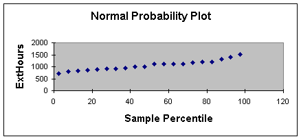
Second, you can look at the Normal Probability Plot which comes as one of the
graphs with the Regression Output. It will normally be to the right of the
regression tables. Worksheet 2.2.3 illustrates the Normal Probability Plot for
this example.
Worksheet 2.2.3
This method takes some
experience and an "artistic eye" (I guess I am not much of an artist
since I prefer looking at the standardized residuals which only requires
application of a simple rule). When the normality assumption is met, the normal
probability plot should approximate a straight line as shown in Worksheet
2.2.3. When there are outliers, one or more of the values of Y will show off of
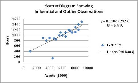
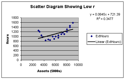
the straight line. Here is an example of a scatter diagram showing an outlier
(Worksheet 2.2.4).
Worksheet 2.2.4.
The normal probability plot is shown in Worksheet 2.2.5.
Worksheet 2.2.5.
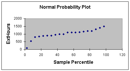
Please notice how two points appear off the line. These would suggest
investigation as outliers or influential variables. The other nice use of the
normal probability plot is the identification of multiple modes. A scatter
diagram may suggest that there are one or more clusters of data that would
suggest stratification and separate regression models. The normal probability
plot would show this as two or more separate plot lines, rather than one.
The Errors Have Constant Variance
As stated earlier, if the model was properly created and tested, and the
data was randomly collected, the errors should be constant for all values of
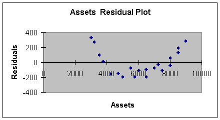
the independent variable. Another plot is used to test this assumption. It's
called the Residual Plot, and appears as in Worksheet 2.2.6.
Worksheet 2.2.6
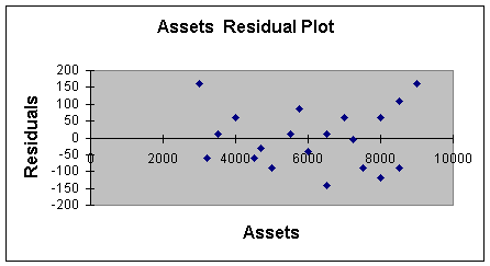
The analysis of the residual plot also takes some art. To meet this assumption,
the residuals should not show any patterns, and the variability should be about
the same for low values, medium values and high values of X. It appears that
the variability around 3000 is from -50 to +150, at 7000 its -150 to +50, and
at 9000 its -100 to +100. The ideal picture would be something like -150 to
+150 for all values of X, or even better, -50 to +50 for all values of X.
However, this variability isn't "too bad". Violations of this
assumption may result in residual plots that show, for example, very small
variability at the low values of X and extreme variability at the high values.
Worksheet 2.2.6 does not have that "fan" shape. Note that the
"fan" shape could be wide on the left and narrow on the right, or
even narrow at the ends and wide in the middle like a "football".
The other knowledge we get from the residual plot is a pattern that may suggest
we incorrectly specified the model. To illustrate, suppose we tried to fit a
simple linear regression model to the data set shown in Worksheet 2.2.7.
Worksheet 2.2.7
Here is what the residual plot would look like.
Worksheet 2.2.8
This residual plot shows a pattern reflecting high positive error at low values
of X, negative error at middle values of X, and high positive error at high
values of X. A curve would have been a better model to fit this data - we will
do than in Module 3.
Errors are Independent
This assumption means that the value of one error should not impact or
effect the value of successive errors. To detect this, the residual plot is
used as with the second assumption, and the observations should be recorded in
time series sequence. When the residual plot does not show any pattern, the
assumption is probably met. When there is a pattern, then the error terms and
the observations themselves are not independent.
The most frequent cause for not meeting this assumption is with time-series
data. For example, if there is strong seasonality the residual plot may
demonstrate a wave pattern going though the peaks and valleys of seasonality.
Since there is a pattern, the analyst should make an attempt to build a
multiple regression model to address the seasonal variation as another
independent variable, rather than leave it in the model and violate the
assumption. We will address this item in Module 3.
Because time series frequently violate this assumption, many forecasters rely
on time series forecasting models, such as time series decomposition or
exponential smoothing rather than regression to build their predictive models.
You will cover this topic in the quantitative methods and production management
courses in the MBA curriculum.
Some texts, such as the references listed at the end of these notes, discuss
the Durbin Watson statistic as a specific numeric test of independence. I will
not address this as Excel does not incorporate this test or the Durbin Watson
test statistic table. We will rely on good data collection practice and
interpretation of the standardized residuals, and residual and normal
probability plots for testing the assumptions.
Step
7: Use Model for Prediction
After a model has
been tested for practical and statistical utility, and after the assumptions
have been checked, it is time to use the model for prediction. Please don't
think that it takes a huge investment of time to get to this point. After a
couple of regressions with the Excel software, you will be able to test utility
and assumptions in a few minutes. Recall testing for practical utility just
involves looking at the R2 and Standard Error of the Estimate.
Testing for statistical utility requires a quick look at the p-value. Testing
the assumptions requires a scan for outliers and multimodes in the standardized
residuals and normal probability plot; and a scan for patterns or fan or
football shapes in the residual plot. Of course, it will take more time if any
assumptions are violated requiring that a new variable be selected, new data be
gathered, or a new model constructed.
Let's say that the model passed the practical and statistical utility test, and
the assumptions checked out ok. Now its time to make a prediction. Suppose we
want to predict how long it would take to audit a client who has $8,400,000 in
assets. The first thing we do is a point estimate for external hours.
Eq. 2.2.6: Ext Hours = 440.05 + 0.10 (8400) = 1280 hours
Next, incorporate the prediction interval around the point estimate. The prediction interval is created just as before, +/- 2 times the standard error of the estimate. So, we are 95% confident, that the actual external hours will be between:
Eq. 2.2.7: 1280 +/- 2 (91) = 1280 +/- 182 = 1088 and 1462.
The predictions of values for the dependent variable for each of the values of
the independent variable in the sample data base are shown in a chart called
the Line Fit Plot. This chart comes with the Regression output, as illustrated
in Worksheet 2.2.9
Worksheet 2.2.9
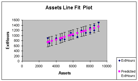
The actual ExtHours and Predicted ExtHours are automatically provided in the
line fit plot. To get the prediction bars to illustrate the 95% prediction
interval, highlight the chart, put the cursor on one of the predicted values
and left click the mouse, select Format on the Standard Toolbar, choose Selected
Data Series, then Y Error Bars, then Custom, then
enter the result of 2 * the standard error (182 in this example) in the + and -
boxes.
For Excel 2007, to
get the prediction bars highlight the chart, put the cursor on one of the
predicted values and right click the mouse, select Layout on the menu
bar, choose Analysis, then Error Bars, then More Error
Bar Options. Select Both for the vertical error bar, and for the error amount
click on Fixed Value and enter twice the value of your standard error (182
in this example) in the blank field.
The interested reader is
referred to the Anderson reference, Section 12.7, or the Levine reference, pages
814-820, for more details on prediction and confidence intervals for
predictions. The prediction interval I introduced in Eq. 2.2.7 is an
approximate interval for an individual prediction. The texts demonstrates a
precise formula as well as a method of making a confidence interval around an
average value of Y. I find that most predictions involve individual forecasts,
such as sales in January, external audit hours for an individual client, and so
forth.
That finishes the material on simple linear regression and correlation
analysis. We will apply the seven step regression process in Module 3, when we
visit multiple regression models.
References:
Anderson, D., Sweeney, D.,
& Williams, T. (2006). Essentials of Modern Business Statistics with
Microsoft Excel.
D. Groebner, P.
Shannon, P. Fry & K. Smith. Business
Statistics: A Decision Making Approach, Seventh Edition, Prentice Hall, Chapter
14
Ken
Black. Business Statistics for Contemporary Decision Making. Fourth Edition,
Wiley. Chapter 13 (Advanced subject: Chapter 16)
Levine, D., Berenson, M.
& Stephan, D. (1999). Statistics for Managers Using Microsoft Excel (2nd.
ed.).
| Return to Module Overview | Return to top of page |