- A two part control consisting of small circles, diamonds, or rectangles and choice descriptions.
- When a choice is selected the option is highlighted and any existing choice is automatically deselected and un-highlighted.
- To set one of a small set of mutually exclusive options.
- Easy to access choices.
- Easy to compare choices
- Users do not have to remember choices.
- Preferred by users.
- Consume screen space
- Limited number of choices.
- For setting attributes, properties, or values.
- For mutually exclusive choices(i.e. only one choice can be selected).
- Most useful for data and choices that are:
- Discrete.
- Small and fixed in number.
- Not easily remembered
- In need of a textual description to meaningfully describe the alternatives.
- Most easily understood when the alternatives may be seen together and compared to one another.
- Never change in content.
- Provide meaningful, fully spelled-out choice descriptions clearly describing the values or effects set by the radio buttons.
- Display in a single line of text.
- Display using mixed-case letters with each significant word capitalized.
- Position descriptions to the right of the button. Separate by at least one space from the button.
- When a choice is conditionally unavailable for selection, display choice description grayed or dimmed.
- Include a NONE choice if it adds clarity.
- Show a minimum of two choices and a maximum of eight.
- A columnar orientation is the preferred manner of presentation.
- Left-align the buttons and choice descriptions.
- If vertical space if limited, orient the buttons horizontally.
- Provide adequate separation between choices so that the buttons are associated with the proper descriptions.
- A distance equal to three spaces is usually sufficient.
- Enclose the buttons in a border to visually strengthen the relationship they posses.
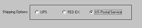
- Poor Example
- Better Example
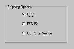
- Best Example