Check Box
Description
Purpose Advantages
Disadvantages Usage Choice Description
Size Structure
Examples
Description
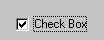
- A two-part control consisting of a square box and a choice text.
- Each option acts as a switch and can be either "on" or
"off."
- When an option is selected (on), a mark such as an "X"
or "check" appears within the square box, or the box is highlighted in some
other manner.
- Otherwise, the square box is unselected or empty (off).
- Each box can be turned on or off independently and can be used
alone or grouped in sets.
- Purpose
- To set one or more options as either on or off.
- Advantages
- Easy to access choices.
- Easy to compare choices.
- User does not need to remember the choices.
- Disadvantages
- Consume screen space.
- Limited number of choices.
- Single check box difficult to align with other screen controls.
- Usage
- For setting attributes, properties, or values
- For non-exclusive choices (i.e., more than one choice can be
selected).
- Most useful for data and choices that are:
- Discrete.
- Small and fixed in number.
- Not easily remembered
- In need of a textual description to meaningfully describe the
alternatives.
- Most easily understood when the alternatives may be seen together
and compared to one another.
- Never change in content.
- Can be used to affect other controls.
- Choice Descriptions
- Provide meaningful, fully spelled-out choice descriptions clearly
describing the values or effects set by the radio buttons.
- Display in a single line of text.
- Display using mixed-case letters with each significant word
capitalized.
- Position descriptions to the right of the button. Separate by at
least one space from the button.
- When a choice is conditionally unavailable for selection, display
choice description grayed or dimmed.
- Size
- Show a minimum of one choice and a maximum of eight in a grouping.
- Structure
- Provide groupings of related check boxes.
- A columnar orientation is the preferred manner of presentation for
multiple related check boxes.
- Left-align the check boxes and choice descriptions.
- If vertical space on the screen is limited, orient the boxes
horizontally.
- Provide adequate separation between boxes so that the buttons are
associated with the proper description.
- A distance equal to three spaces is usually sufficient.
- Enclose the boxes in a border to visually strengthen the relationship they possess.
- Examples
1. See radio
buttons. Substitute a check box for a radio button.
Previous|Next